 |
| by David Allyon |
Monday, May 6, 2013
Does it Make a Sound
Nowhere Man

This is a poster design featuring the lyrics of one of my favorite Beatles songs, "Nowhere." It uses the elipses font with 1966 in black and the lyrics in blue . On the right side a sphere with a man standing on the south pole disappearing as a paint stroke or smoke. the background color is tan. I could not find the artist name.
Wednesday, May 1, 2013
Black Hole
http://www.behance.net/gallery/habitissimo/8350695?utm_source=Triggermail&utm_medium=email&utm_campaign=Net%20Project%20Published
habitissimo
http://www.behance.net/gallery/habitissimo/8350695?utm_source=Triggermail&utm_medium=email&utm_campaign=Net%20Project%20Published

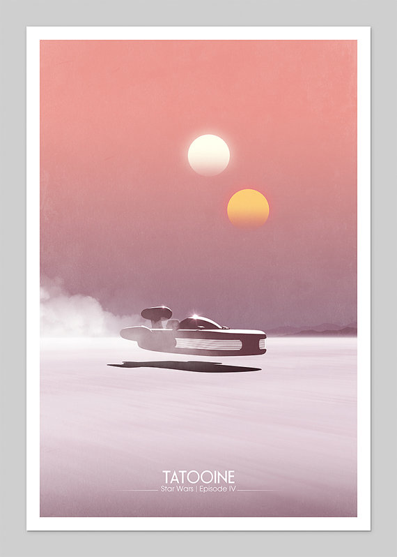


Star Wars retro-posters

- - Star Wars Posters - Patrick Concepion - San Jose, California
A series of three 12" x 18" art prints. This was printed on thick uncoated French Paper Company Construction Whitewash 100 lb cover stock.
The original Star Wars episodes - A New Hope. Features orange and yellow circles to create the Dune Sea of Tattooine and black silhouettes of Artoo Detoo and See-Threepio. The titles are in very simple non caps . the colors are faded which gives them a faded feel.
The Empire Strikes Back, had a light blue "sky" in the header and white background represents the snow of Hoth and a silhouette of the Imperial Probe droid.
Return Of The Jedi. Green triangles represent the Endor forest and the deaths star is in the sky.
I so want these. I'd also like to create my own version of these.
flyer designs
 |
| Flyer design on Etsy |
Various flyer designs found on Etsy.com by Sarah and Seven Carter of Newark, DE.
1. A basic logo with brand colors a pastel green and a grayish gradient. Logo placement is dead and high up which is not very exciting and doesn't stand out
2. Lavender or mauve background color. The type for "salem village" is rotated vertically which plays off the yellowish bars which draw the eye to the photo.
3. A Realty company ad which contains a lot of information ad photos in a limited space. Negative space earth logo is hard to make out. The colors are kind of dark and drab.
4. This is a flyer for Sephora cosmetic store. They target audience is females with lots of pink and black. A photo of lipstick in a circle. A very handwritten looking font which is common for this type of ad.
5, Pool Party. Cool blue for the background btright pink and yellow text in a goofy fonts which might be comic sans or something crappy like that and a filmstrip with photos.
6. Rockwood Apartments - realty flyer - effective use of ovals and circles more.
7 and 8. aren't very interesting


Subscribe to:
Posts (Atom)